A new way to do taxes
Impact
The customer-support feedback is informal, not measured data.
Only 5% of customers completed their tax return on a smartphone.
Overview
Fiscozen is a digital platform with real accountants and tax advisors that helps freelancers and self-employed people in Italy deal with taxes, invoices and paperwork.
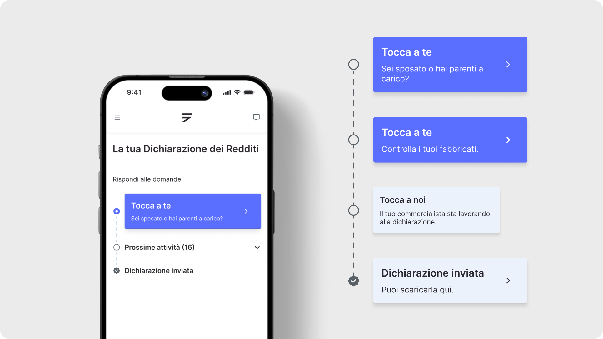
I redesigned Fiscozen’s tax return (Dichiarazione dei Redditi) from scratch for the new mobile app, turning it into a guided path made of “stops”, like a subway map. I worked with the PM and with Fiscozen’s accountants.
Context
Fiscozen’s app was built almost entirely for desktop. After the full redesign, users could finally use it on their phones, but one of the most important parts of the product was missing, together with invoicing: the tax return. The founder asked us to bring it to the new mobile app as soon as possible, with a clear brief: make it as guided as possible, while still letting people go back and forth.
The problem
For any freelance, the tax return is complex and stressful.
It’s full of technical terms, and mistakes have real consequences. The old version didn’t help:
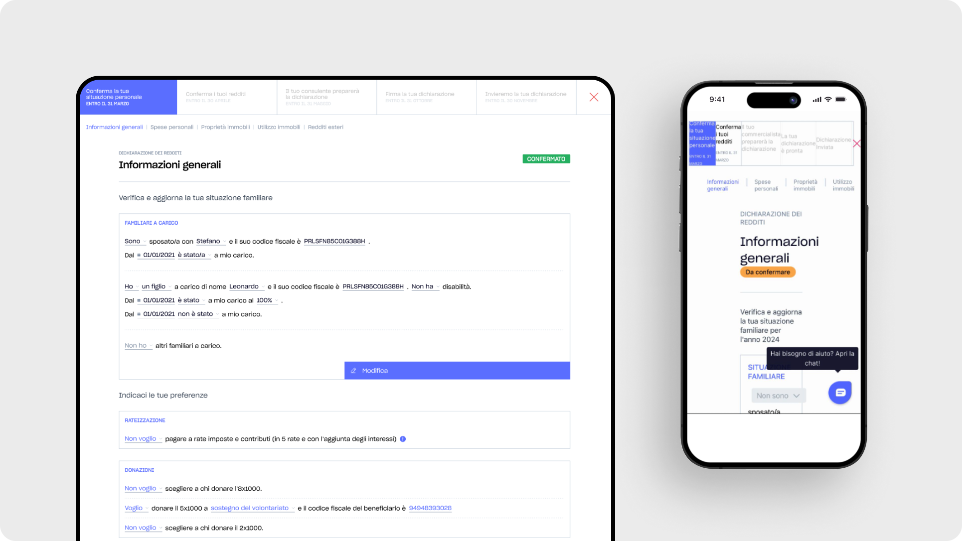
- an outdated interface, disconnected from the new look of the app;
- built for desktop only;
- based on a natural language form (NLF), which left almost no room to explain what each field was asking for;
- far from the idea of a “guide” that was becoming the principle behind the whole product.
A survey I had run the year before on a sample of users showed that only 5% completed their return on a smartphone.
Assumption and process
The founder’s direction, together with years of user feedback, pointed to one hypothesis: users needed to be guided step by step, even more than we were already doing.
To test it, I ran dedicated study and mapping sessions with the PM and our tax experts, who covered the fiscal and legal side, going through every flow of the previous version to see what was already there. The result showed us the most common patterns, and gave us a layout, both visual and mental, that works for almost every case.
Solution
That research became a clear path users follow to complete their return.
A complete map
We only ask for what we need, one step at a time. The first thing users see is a single question, in a friendly and calm tone, inviting them to give us the information required. We start with family: “Are you married or do you have dependents?” That already tells users what kind of data to expect.
Users can also see and open the next sections, so they always know how much is left and can move freely.
Inside each section, we show the data we already have (for example, if they were already a customer) and ask only the specific questions needed to complete it for the past year. They never have to touch fields that are already right.
The information required for a tax return is a lot, so we grouped it into sections. We kept them consistent, but each section has its own needs, so each one works a little differently. Across all of them, the forms are designed to keep cognitive load as low as possible and make completion faster.
Tone of voice
Besides the flows and interactions, I also wrote the copy and defined the tone of voice. A tax return is a stressful, complicated moment, so the wording had to reassure and make users feel looked after at every step.
Impact and outcomes
This version shipped a few months after the full app redesign, so the results come from both. Mobile now accounts for 25% of visits to this section, up from almost zero the year before, with minimal communication around the launch. Average time for a first-time return went from about 15 minutes to about 10. And in conversations with customer support, many users said they barely remembered filling it in.
This project was huge and I’d really love to discuss more about it in person.